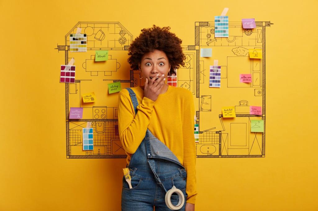
Color Confidence: Crafting the Perfect Palette for Modern Interiors
Chosen theme: Choosing the Perfect Color Palette for Modern Interiors. Step into a world where hue, light, and texture collaborate to shape mood and function in every room. Join the conversation, subscribe for fresh palettes, and tell us which colors your modern space is craving.
Warm tones encourage connection and appetite, while cool hues calm the mind and sharpen focus—both valuable in modern interiors. Blend them intentionally, assigning warm colors to social zones and cool tones to work or retreat areas for balanced, practical comfort throughout.
02
Neutrals are not boring; they are the scaffolding of modern interiors. Layer complex grays, taupes, and off-whites with clear undertones that harmonize with flooring, metal finishes, and fabrics. A stable neutral base lets accent colors rotate seasonally without visual chaos.
03
Use saturated accents sparingly to direct attention: an azure artwork, a paprika stool, or a saffron throw. Keep saturation controlled and repeat tones at least three times. Modern interiors breathe when accents punctuate, not overwhelm, the clean lines and open space.
Reading Light, Space, and Surfaces
01
Natural Light Mapping by Orientation and Season
North light cools colors, revealing blue undertones; south light warms and can wash out delicate pastels. East rooms shine in crisp mornings, while west rooms glow at dusk. Record these shifts to choose a palette that remains flattering across changing daylight.
02
Scale, Proportion, and How Color Alters Perception
Darker, lower-value colors visually compress, creating intimate corners in modern interiors, while lighter tones expand and brighten. In narrow halls, lighter walls and slightly deeper trim widen the look. Large rooms can absorb moody hues without feeling heavy when lighting supports them.
03
Texture, Sheen, and Material Interplay in Modern Rooms
Matte paints soften geometry and hide imperfections, while satin reveals architectural edges. Pair low-sheen walls with tactile textiles and a subtle limewash effect for depth. Reflective metals and glass amplify light; ensure their undertones sync with your chosen palette harmoniously.
From Mood Board to Tested Palette
Pull five to ten images that reflect how you want your modern interiors to feel: airy, grounded, or dramatic. Identify repeating colors, materials, and undertones. Note lighting conditions in those images; a desert photo reads warmer than a crisp coastal scene.
From Mood Board to Tested Palette
Choose one base neutral that flatters flooring and countertops, two secondary hues for depth, and one or two accents for personality. Add a metal finish and wood tone. Verify undertone alignment across all elements to avoid clashes after installation.
Start with a soft white carrying a whisper of warmth, layer muted spruce or sage textiles, and ground with charcoal metal details. Natural oak and wool add tactility. The result feels bright, timeless, and restorative—ideal for uncluttered, modern interiors that breathe.
Mid-Century Warmth: Earthy Neutrals with Playful Pops
Embrace camel, tobacco, and clay as your foundation, pairing teak and brass undertones. Introduce citrus or teal accents through art and upholstery. Keep walls balanced with off-white cream. The contrast feels optimistic, capturing mid-century spirit without sacrificing contemporary clarity or calm.
Creating Flow in Open-Plan Interiors
Use one base color throughout and shift value gently to define zones. Dining can deepen half a step; the lounge can lighten. Repeat one accent across both zones so the eye glides, creating sophisticated flow within expansive, modern interiors.
Longevity, Sustainability, and Care
Choose scrubbable, low-sheen wall paints for high-traffic areas, and stain-resistant performance fabrics in coordinating hues. Protect baseboards and doors with tougher enamels. A resilient finish plan preserves your palette’s clarity, keeping modern interiors sharp even with pets, parties, and frequent cooking.